
Concept project · Poster & cover exploration
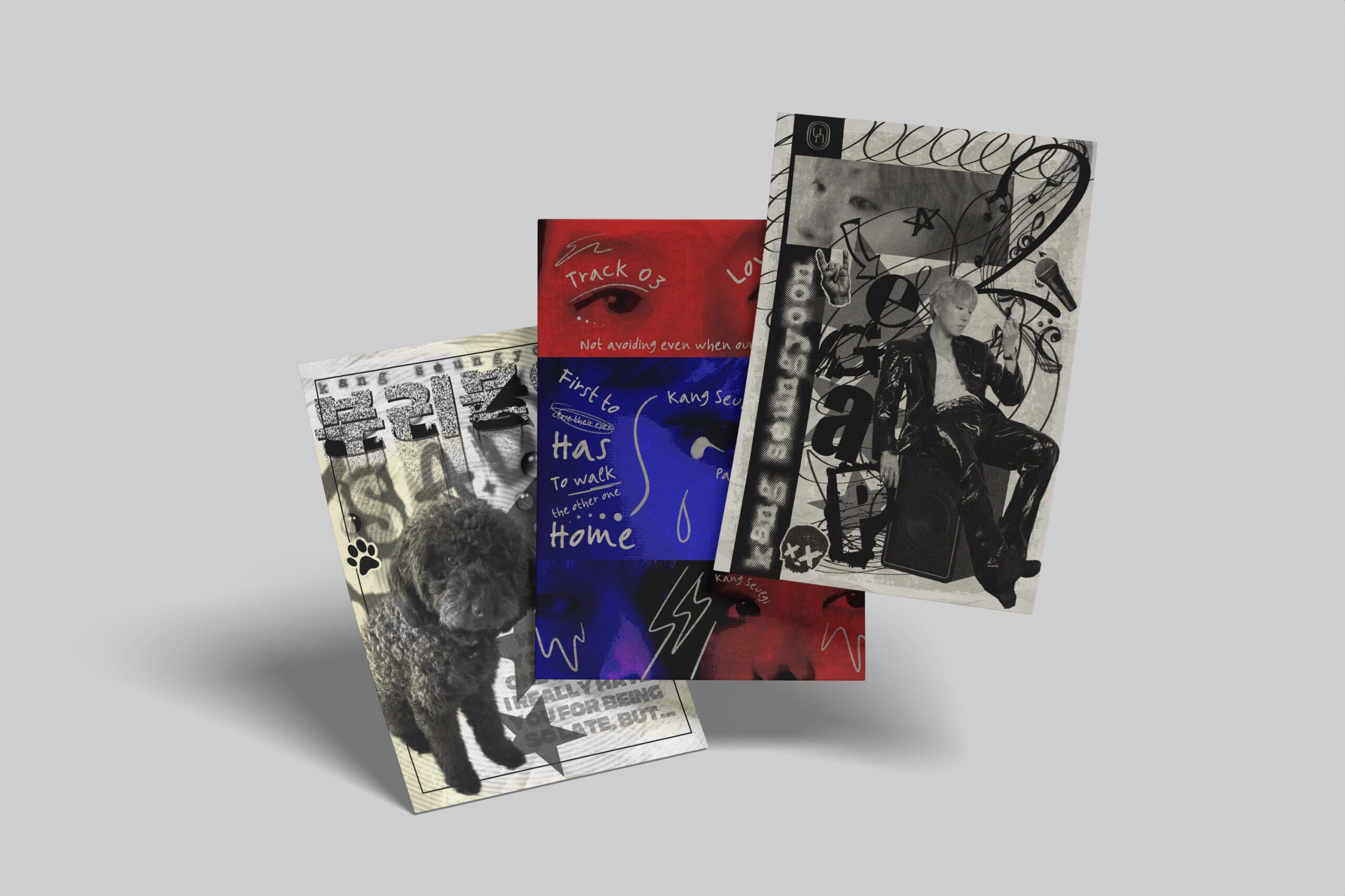
This project is a non-official visual concept inspired by the album Page 2 by Kang Seungyoon.
Howere, this project was developed prior to the album’s official release, and so the project explores an emotional and interpretative visual direction through a series of posters focused on selected tracks.
Objective:
To create a series of expressive posters that visually interpret different emotional states present in the album, experimenting with contrast, layering, and symbolic imagery.
Tracklist Poster — Key Visual
Concept:
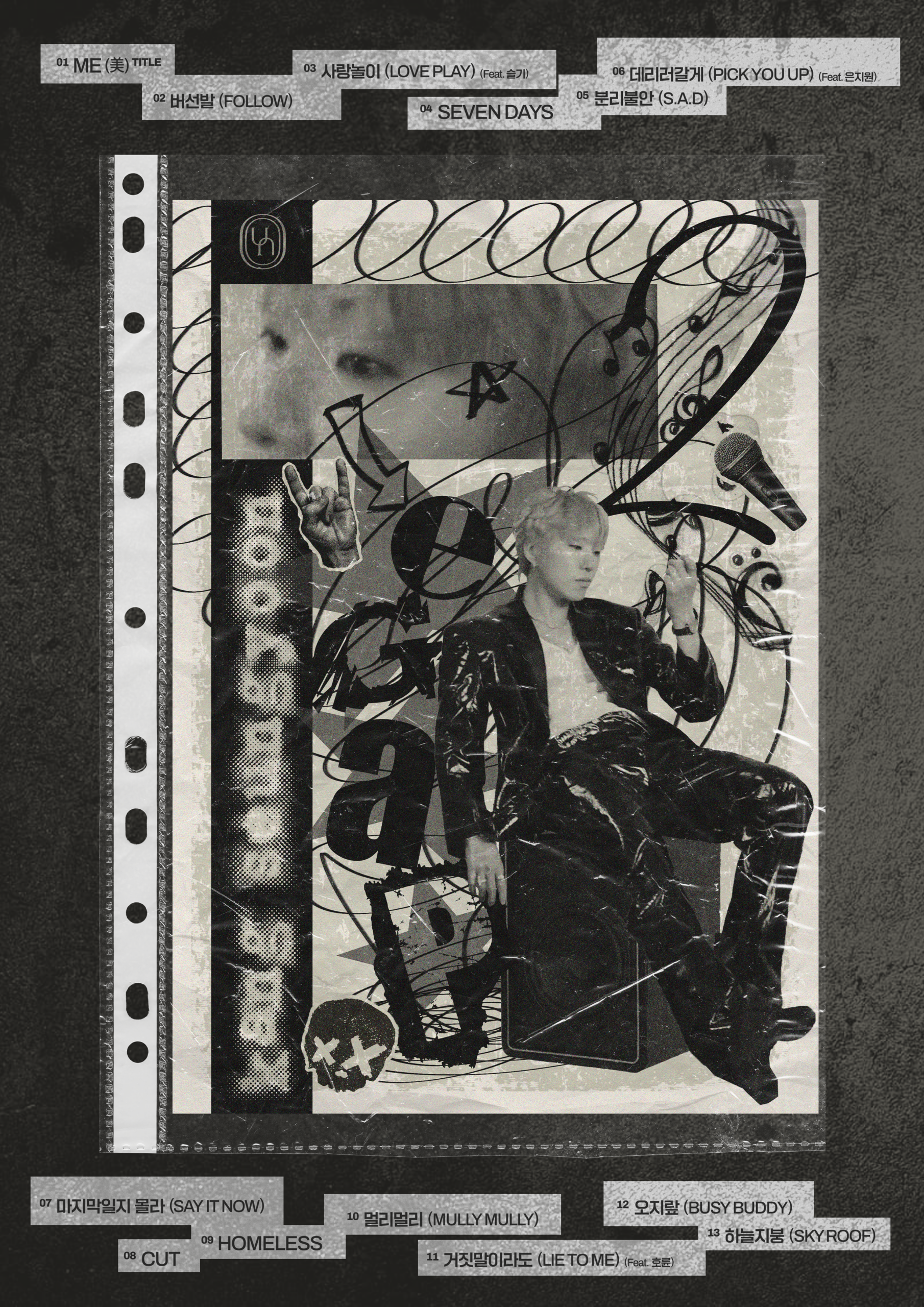
The tracklist poster serves as the core visual reference for the project, introducing the album as a whole before moving into individual song interpretations.
Its design emphasizes structure, density, and rhythm, mirroring the narrative progression of the album.
Design Elements:
Details and Accents: Layered textures, subtle grain, and overlapping elements are used to add depth and visual tension. These details enhance the editorial quality of the poster while maintaining a raw, expressive tone.
Color Palette: A predominantly black-and-white palette reinforces contrast and clarity, allowing typography and composition to remain the focal points. The absence of color creates a neutral base that supports the project’s more emotionally driven visuals and for its vintage pop-punk concept.
Imagery: Fragmented photographic elements and abstract forms are combined to suggest complexity and emotional layering rather than literal representation.
Typography: Typography is treated as a compositional structure. Variations in scale, weight, and spacing establish hierarchy within the tracklist, guiding the viewer through the information while maintaining visual tension.
Song Poster 1 — Love Play
Concept:
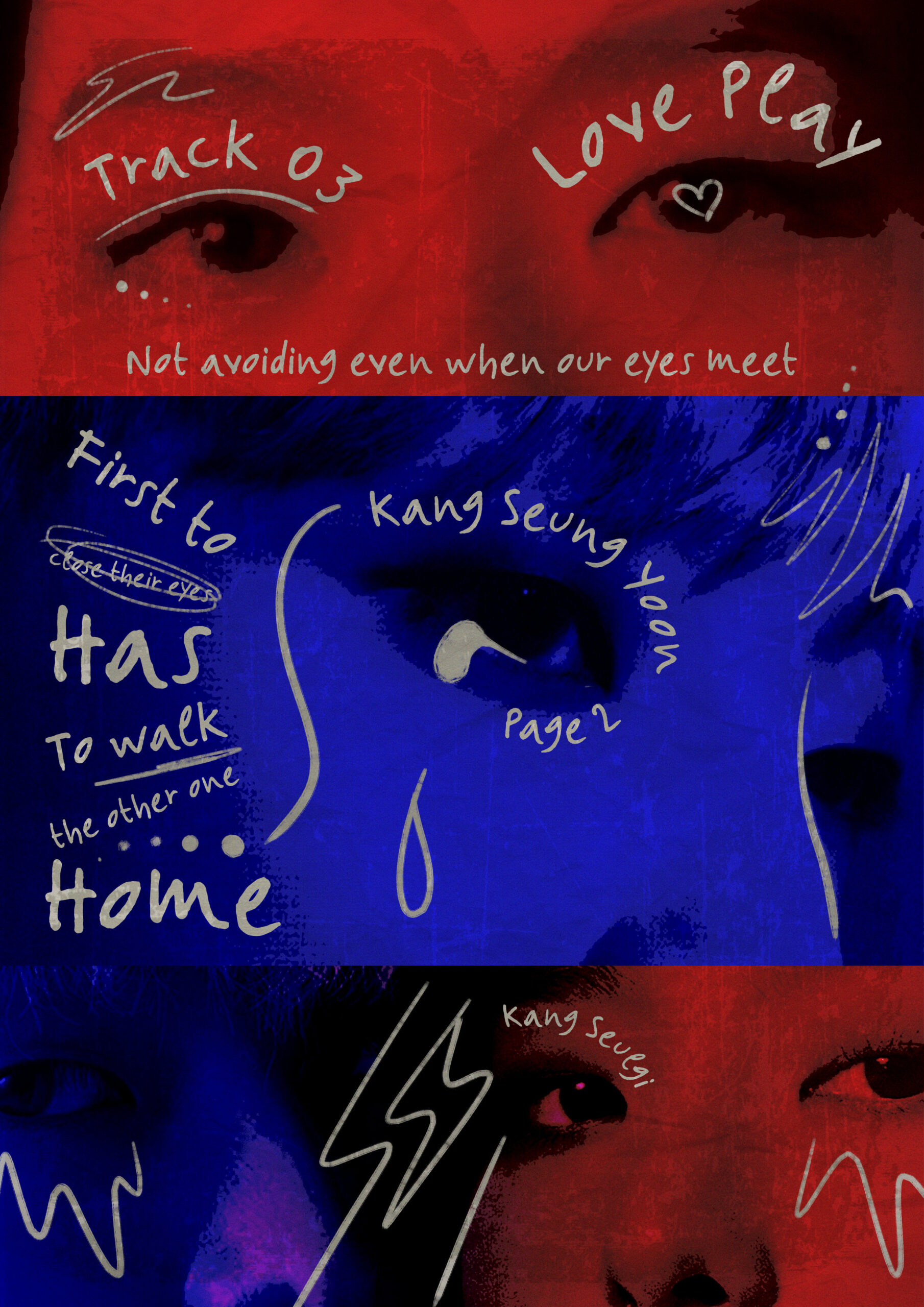
This poster translates the emotional intensity of the song into a more subjective and expressive visual language, shifting away from structure toward feeling and internal conflict.
Design Elements:
Details and Accents: Handwritten marks and imperfect lines introduce a sense of intimacy and vulnerability. These elements act as emotional traces rather than decorative details.
Color Palette: The dominant use of red and blue represents emotional duality and internal tension, as well as the two artists’ groups’ colours. The strong contrast between these colors amplifies the sense of conflict and introspection.
Imagery: Close-up and fragmented imagery is used to create immediacy and emotional proximity, encouraging a visceral rather than rational interpretation.
Typography: Typography appears less controlled and more gestural, reinforcing the emotional nature of the poster. Handwritten elements contribute to a confessional, personal tone.
Song Poster 2 — S.A.D
Concept:
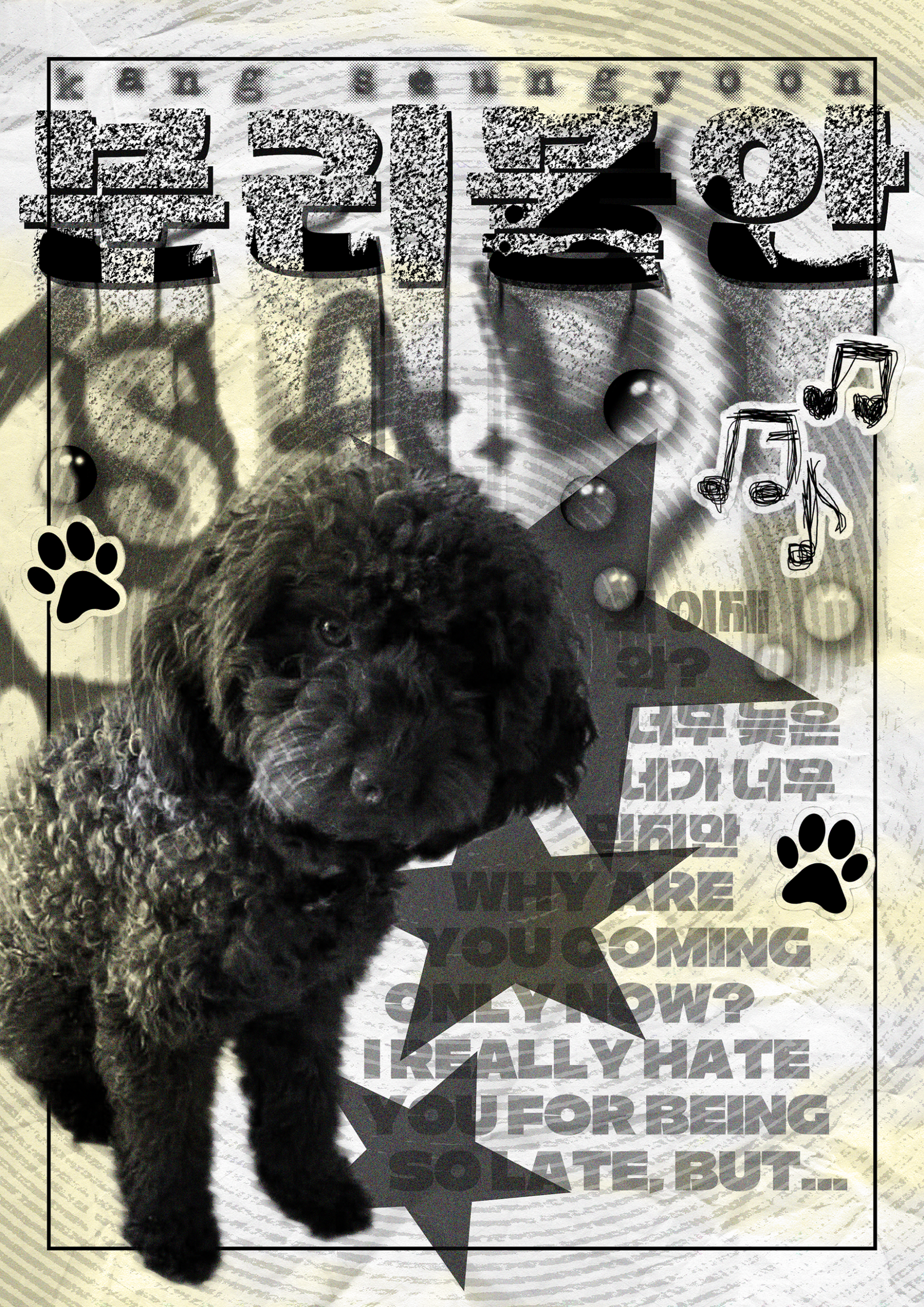
This visual adopts a symbolic approach to represent themes of separation anxiety and emotional dependency through an unexpected yet familiar subject.
Design Elements:
Details and Accents: A soft and restrained color palette supports the gentle yet melancholic tone of the song, avoiding strong contrasts to maintain emotional subtlety.
Color Palette: A soft and restrained color palette supports the gentle yet melancholic tone of the song, avoiding strong contrasts to maintain emotional subtlety.
Imagery: The choice of a dog as the central subject reflects the song’s narrative, which was inspired by the artist’s observation of his dog’s anxiety when left alone. The familiar imagery creates emotional contrast and immediacy.
Typography: Typography is understated and secondary to the image, allowing the concept to communicate primarily through symbolism and mood.
Outcome:
The final outcome is a conceptual poster series that explores music-driven visual storytelling through emotional interpretation rather than commercial branding.